Applying UX Internally for the Enterprise
9000 employees finally receive the right training content

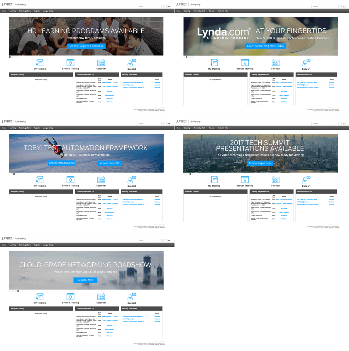
Sample Juniper University Programs
Overview
As background, Juniper shifted strategy from hardware to cloud. Facing cloud startups with a low barrier to market entry, Juniper prioritized rapid learning and development to keep its enterprise both talented and agile.
As a result, our legacy Learning Management System, Juniper University (JU) needed critical usability enhancement. This is where I came in.
As JU's sole UX contributor, I helped our technical training leaders to launch user-friendly learning programs to drive better conversion and business outcomes for 9000 employees.

Juniper University (JU) delivers learning & training to its employees within the Learning Management System (LMS).
Problem
Over 15 years, the JU system acquired nearly 10,000 courses. By speaking with functional heads, employees, marketing, and reviewing Google Analytics, I found that managers regularly used JU to upload content and email users a link to take it.
That explained why it lacked course categorization, tagging, and filterability. With business in need of a quick transition to cloud, finding the right training became critical.
We specifically found the JU welcome (landing) pages deficient:
-
Untargeted content – everyone gets the same page.
-
No one is directed to relevant courses.
-
Search doesn't work because of random title and description.
-
No calls-to-action.
Before
Contents were not targeted to the right users, so everything is needlessly shown to everyone.
Observation of the website, analytics, and user research suggested useful data points like:
-
2:57 minutes spent on landing page
-
24 seconds to cycle through 8 banners
-
4 excessive clicks-per-module
-
71% traffic drop-off from the landing page
After

Banner now organized and targeted to a Field Sales user with 3 relevant calls to action.
Based on such data, I set the design goals for the landing pages to:
-
Reduce cognitive overload
-
Provide clear calls-to-action
- Reduce click count
These goals were tightly correlated with conversion goals that drive business outcomes:
-
A user must complete required training
-
A user should take position specific training
-
A user should feel excited about additional learning
Outcome
As a result, our platform changed significantly. To reach our goals, we integrated HR employee data to target employees with unique landing pages by department, position, and tenure. And then managers tagged actively used courses.
This removed the immediate need to clean up search tags for 10,000 courses. It also removed irrelevant rotating banners, clarified calls-to-action, and allowed managers to continue sending links to courses: the HR data tags and segments the courses when managers identify required courses.
Furthermore, we implemented a new site structure to reduce complexity, e.g., intuitive workflow, and reduced click-counts to access training.

A simplistic site workflow
These solutions are now being shipped. The UX suggestions were intuitive and well received across the organization.
She (Min) always displayed empathy with users, asked insightful questions that helped us clarify the problems we were trying to solve, and devised solutions where the rest of us just saw limitations and barriers.

THE PROCESS
It was not always pretty day in UX, however. The process was intense. With multiple stakeholders scattered across the organization, the challenge to align their learning & development mission with UX took nearly a year of collaboration, consensus building, and negotiation. To do so, it was critical to speak up after careful introspection, planning, and clarification.
1. Gathering user insights
First in my process, I set up Google Analytics and casually talked to course takers. I found that each persona had a unique association with training, but the common challenges were:
-
Users don't know about the learning resource
-
Users don't have time to complete training
-
Users don't know how to use the platform (searching and finding relevant courses)

User personas by job-role

Data shows that our users spend 2 minutes 57 seconds on the welcome page (landing page) and 71.8% drops-off
2. Engaging stakeholders
After examining the user, I talked to technical training leaders across Engineering, Field Sales, Sales Eng, Marketing, Customer Success, HR and Legal. By doing that, I was able to understand their perspective as well as build a relationship.

Department profiles – a snapshot of each training management teams
Their perspective was transactional. They simply developed training, sent it out, and measured completion rate and rating. They also assumed UX design was web design. So they threw it over the fence to me, to "make it pretty."
To evangelize user experience in this context, I introduced a 5E Customer Journey map combined with Service Blueprint (below). This helped JU stakeholders visualize our training lifecycle and then we could drill down on areas to optimize. This highlighted areas where the user gets stuck and enabled leaders to start making suggestions with respect to user experience, rather than just making things pretty.

Customer 5E Journey + Service Blueprint
Additional insights:
-
Employees generally lack time to take training –– AM travels frequently. CSS are on the phone.
-
Different groups like different types of training –– HR prefers live, instructor-led. Marketing likes virtual.
-
Training material lifecycles vary across groups –– SE content gets outdated in months. CSS remains for years.
-
Training is initiated differently –– Engineers love sharing tip sheets. Sales wants training consistency.
-
Some training programs are ready to launch today vs. some are not.
-
Juniper-specific training is better developed internally; others can be outsourced.
With more stakeholder buy-in at this point, my design questions were:
-
How might we create personalized landing pages, avoiding one-off customization for each department?
-
How might we make the implementation frictionless for training leaders, allowing to continue uploading and then emailing courses as before?
-
How might we improve site flow that converts to course completion?

Whiteboarding with stakeholders

Detailed wireframes
3. Putting things together
After extensive discussion, we came up with a landing page that uses integration logic. Roughly speaking, courses are automatically assigned based on the employee's tenure, position, and role in the HR data.
That is, stakeholders could continue to create courses and share them, and each employee only sees the relevant courses when they log in. Users are no longer flooded with unsearchable, unfiltered, courses from the early days.
The experience for both stakeholders and employees was widely improved.